LSEG
·
Oct 2022 - May 2024
London Stock Exchange Group
Evolving and scaling Forge, LSEG's design system, across its whole component library, from Figma architecture and accessible data visualisation to the group-wide rebrand.

Role
Senior Product Designer
Timeline
Oct 2022 - May 2024
Team
Forge design system team
Platform
Web / Mobile / Design System
Overview
The design system behind LSEG's public websites
London Stock Exchange Group runs financial market infrastructure, index and data businesses worldwide. Its public websites, from LSEG and London Stock Exchange to FTSE Russell, are built on Forge, the group's design system. I joined through Tata Consultancy Services as the senior product designer on Forge's design system team, working alongside LSEG's UX Director, front-end engineers and the product and web designers who build with the system. My remit was the system as a whole. Forge is a live library of hundreds of components, and over the engagement I worked on every one of them, alongside its foundations, data visualisation, documentation, change management and the day-to-day support that helps teams adopt it.
Figma migration
The whole library rebuilt from Sketch into Figma
Component lifecycle
Created, revised, deprecated and documented across the whole library
Group rebrand
A masthead and navigation carrying the group's brands under one umbrella
Challenge
Keeping a live system trustworthy while rebuilding it
Forge had to stay usable, accessible and consistent while almost everything around it changed. The library was moving from Sketch to Figma, Figma's own capabilities were changing mid-engagement, and the group rebrand asked one design system to carry several distinct brands. Designers and engineers relied on Forge throughout, so none of that change could come at the cost of stability.
How do you rebuild a design system underneath the teams who depend on it, and leave it more flexible, more accessible and easier to maintain than you found it?
Approach
Every component, from foundations to a group rebrand
Working across the whole system
Over the engagement, every component in the library came across my desk: I revised and refined existing components, rebuilt those that needed a new structure, deprecated those that had been superseded, and created new ones where teams had a genuine need. The work spanned foundations, colour and iconography, through buttons, form fields, cards and site headers, to the most complex components in the system. LSEG’s UX Director trusted me with the most technically demanding of them, and I took the lead on several.
Working at that breadth meant judging each change against the system rather than the single component: how it related to its neighbours, which patterns and properties it should share, and what the change would mean for the sites already built on it. A deprecated component needed a clear replacement; a new one needed to earn its place rather than duplicate something that already existed. Every component carried its own documentation, and we refined the documentation standards throughout the engagement so guidance stayed consistent as the library grew.

Left Button family: primary, secondary, pill and document variants. Right The rest of the family, with every state documented.
Rebuilding the working system in Figma
During the migration from Sketch, I rebuilt and refined components into a usable Figma library with responsive layouts, clear variants and states, and the flexibility to handle different content and brand contexts. As Figma’s capabilities developed during the engagement, we made extensive use of auto layout, variables and component properties, making the library more adaptable for the designers using it and easier for the team to maintain.
The library followed an atomic structure, with smaller components nested inside larger ones, and much of the craft was in that nesting: how a nested component behaved when its parent changed, which properties it exposed to the component around it, and when composing existing parts was right versus when a pattern needed a new component built from scratch.
We were just as deliberate about what not to adopt. Figma was shipping new features quickly, and a third-party plugin that solves a problem today can become a dependency for years. From my experience, I pushed for treating every feature and plugin we built on as a long-term commitment: leaning on more than we needed would create technical debt the team would have to maintain, and eventually unpick. We adopted capabilities when they earned their place, not the moment they appeared.
Design tokens are a good example. Rather than adopting them as soon as Figma introduced them, we began implementing them towards the end of the engagement, once they had matured, and rolled them out gradually across the library. The decisions themselves were already in place: colour, type and spacing were defined consistently throughout the system, and we were already designing to those conventions. Tokens formalised them, so each decision is defined once and applied everywhere.
One question came up again and again: how close should the Figma library get to the coded components? Where we landed was that one-to-one parity was never the goal. They are different systems doing different jobs, maintained by different people. The Figma library needed to express design intent, states and behaviour precisely enough for engineers to build from; the coded components needed the flexibility that real content and real browsers demand. Chasing exact parity would have cost additional effort without making either better, only more alike.
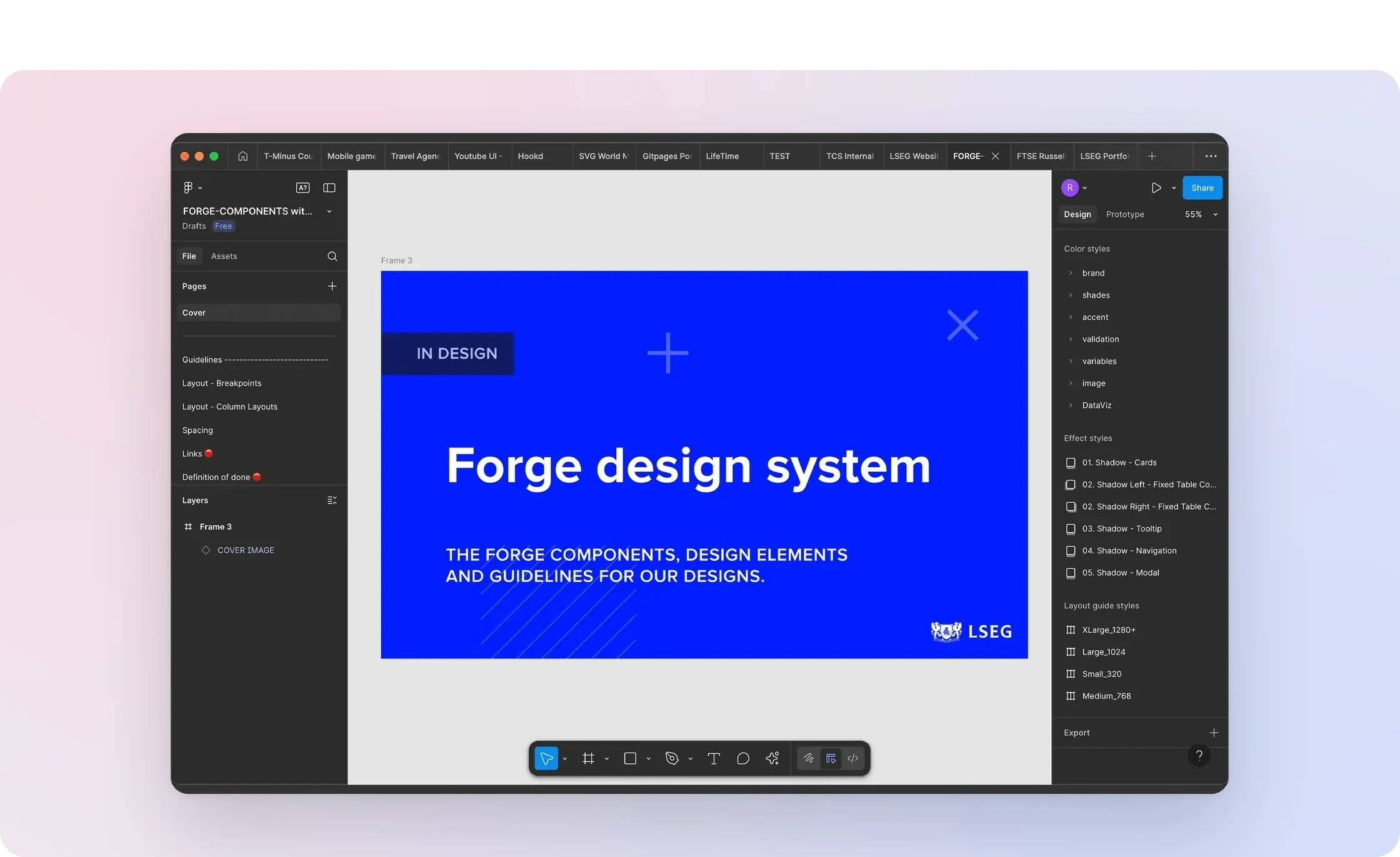
Forge itself in Figma, the library I rebuilt during the Sketch migration.
Accessibility throughout
Accessibility ran through every part of Forge rather than sitting in a separate checklist. Because the library followed an atomic structure, accessibility was built in at the smallest level, in the foundations and base components, and carried up into every larger component built from them. Our job was to maintain it, and to use that structure so a fix at the smallest level reached everything above it. In the colour library, I checked contrast across the graded palettes and extended their structure with reserved positions, so accessible combinations were easy to choose and future colours could be added without breaking the logic of the scale. Typography was set for legibility and clear hierarchy across sizes and breakpoints. Components were reviewed for contrast, focus states and clear interaction states, so every site built on Forge started from an accessible baseline rather than having to revisit it later.

Colour foundations: the graded palette I checked for contrast.
Making complex information consistent
Charts were among the most complex components in the system: intricate to design, and built at the limits of what Figma’s auto layout and constraints could do. As a recognised leader in financial data, LSEG needed charts that were consistent, suited to their data and accessible, following best practice rather than trailing it. I redesigned Forge’s charting system as an accessibility-led update, with particular attention to colour and to how clearly each chart communicates its data. I created a DataViz colour palette with guidance for sequential, categorical and focus use, and extended the range to bar, line, stepped-line, pie, doughnut and scatter treatments.

Left Chart anatomy with numbered callouts: the redesigned charting system. Right Bar chart anatomy with its annotation legend, a configurable chart base.
Rather than a set of fixed pictures, the library gave designers configurable chart bases with responsive sizing and adjustable axes, alongside ready-made examples to adapt. I designed the Charts page and wrote its documentation, including guidance on creating accessible charts: contrast targets of 4.5:1 for text and 3:1 for graphical elements, colour-vision differences, descriptive titles, direct labels versus legends, small multiples for complex data, and text alternatives. The redesigned charts became part of Forge.
Data tables called for the same care. I designed Forge’s data tables across densities, from compact tables for dense financial data to lighter ones for simpler content, with the same intricate nested structure behind them.
Data tables at different densities across FTSE Russell index pages, in Figma (video).

Left Chart variants built from the same base across sizes. Right Chart documentation pages: the ready-made library designers used.
Extending Forge across the group
LSEG’s 2023 group rebrand brought its businesses under one brand architecture, and Forge had to carry it. The masthead is the first thing anyone sees on a group site, and it is where that architecture becomes visible: how the group, its businesses and their sites relate, and how each brand sits beneath a shared umbrella without losing its own identity.
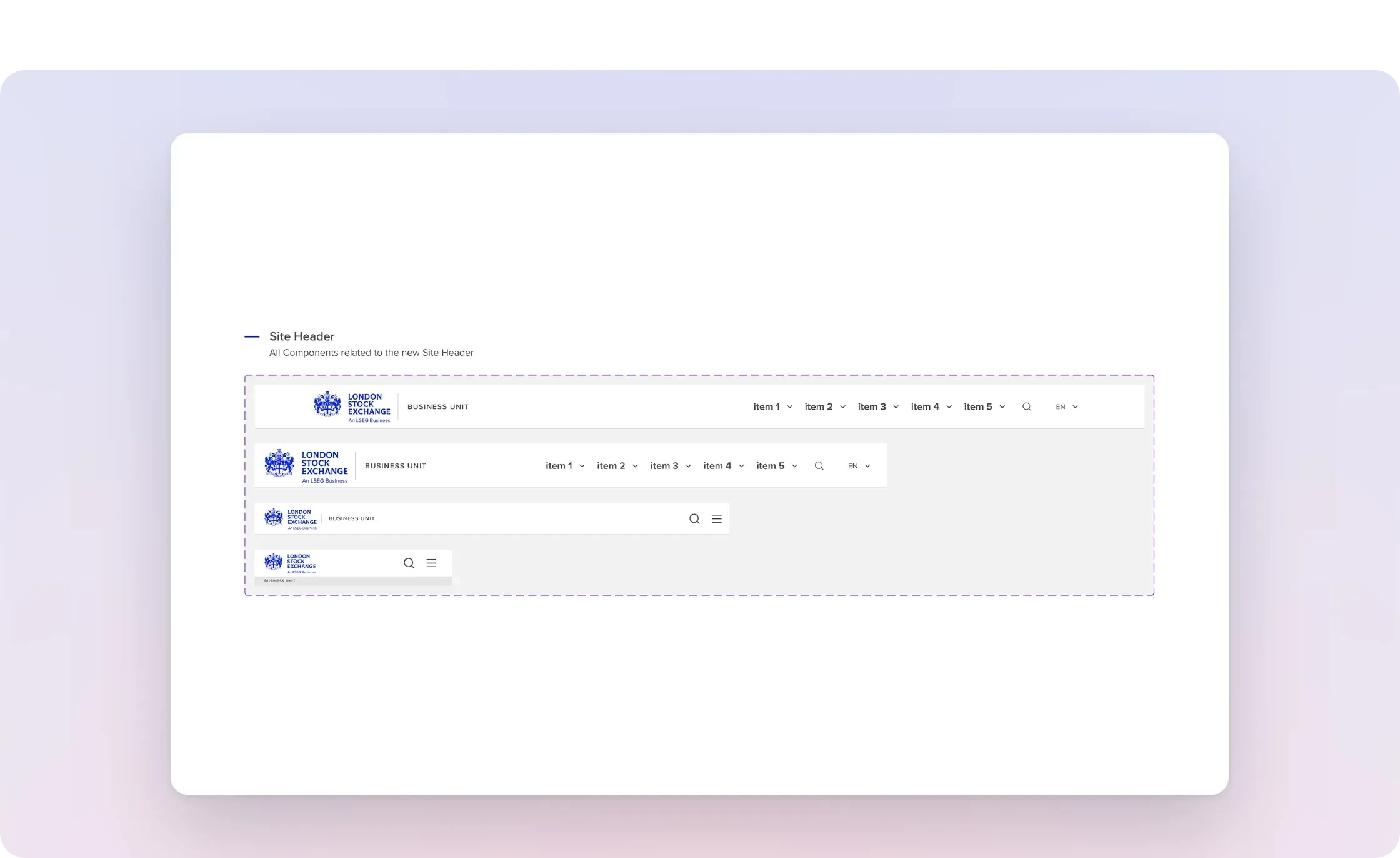
The masthead system for the 2023 rebrand, across breakpoints.
Working with the wider team, I designed that structure from the design system side: a group-level brand bar, the masthead and navigation beneath it, and responsive variants for sites across the group, including London Stock Exchange, FTSE Russell and LSEG FX. We reviewed what each site actually needed, reused patterns where they fitted, and created new variants only where a genuine requirement called for one. That kept one coherent system rather than letting each brand fork it.
The masthead and navigation live on an LSEG business site (video).
Change management
Forge was live infrastructure for LSEG’s websites, and it ran on a formal change-management process. LSEG’s UX Director set up the triage system for requests, and I was part of the change-management team that assessed them: deciding what the system should absorb, what an existing pattern already covered, and what needed a new component.
It was work my background suited. Before moving into design I spent ten years in IT, working within ITIL change management at a bank, where I also introduced ITIL problem management. A live design system carries the same risks as live infrastructure. New designers joining the team would sometimes start editing a published component without realising it was live, or work over the top of another designer’s changes in progress.
We put guardrails in place: publishing rules and guidance for anyone working in the library, Figma branches for changes to live components, and sandbox areas where designers could explore without touching anything published. Every change was logged, triaged and documented in Jira, with release notes as part of that record, and I published my library updates as each change was completed. Within the design system team, we held regular working sessions to keep our approach and skills aligned.
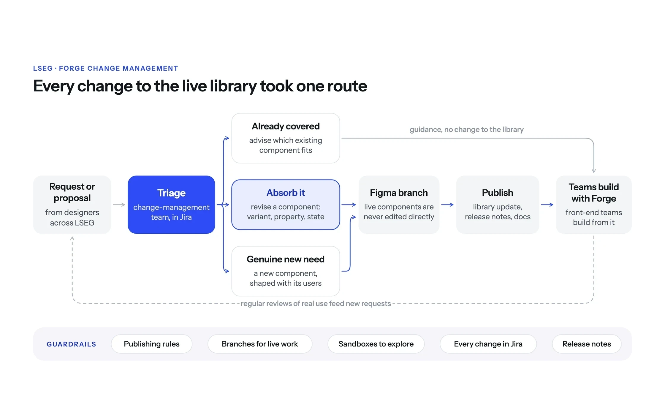
Every change to the live library took one route, with guardrails around it.
Supporting adoption
Designers across LSEG brought requests and proposals through the design system’s change process, from first request through triage in Jira to a published update, and I supported campaign designers with whatever their work needed from the system. Teams could use Forge reliably because there was a team behind it: we corrected errors in the system, advised on which components suited a particular use, and gave accurate guidance where the documentation alone wasn’t enough.
We held regular reviews within the design system team and with the teams using Forge, looking at how components were being used in real work and where the system needed to go next. I shaped new components with the teams who would use them and defined each component’s specification with the front-end teams, who built from Forge directly. As the team changed, I onboarded and supported new designers and contractors so the system’s standards held as people came and went. Over the engagement, adoption grew: more teams used more of the library, more often.
Outcome
A stronger system for the whole group
Forge continues to underpin LSEG's public websites, which together receive millions of visits every month, and my work runs through the whole library: the rebuilt Figma components and foundations, accessibility built into colour, typography and components, documentation for every component, the redesigned charting system, and the masthead and navigation that give the group's brands a shared structure. Adoption grew over the engagement, with more teams using more of the library more often, supported by a working change process and a team they could rely on.
The whole library, revisited
Every component created, revised, deprecated or rebuilt, with clear variants, states, properties and documentation in Figma.
Accessible data visualisation
A redesigned charting system, DataViz palette and written guidance, adopted into Forge.
One structure, many brands
A group brand bar, masthead and navigation that set out the brand hierarchy and let each site keep its identity.
Growing adoption
More teams using more of the library, supported by triage, regular reviews and documentation for every component.
Status
Live in Forge and on LSEG's websites
Live in Forge and on LSEG's websites
View Forge →
Reflection
Systems are built on decisions, not components
The most valuable design system work was often the least visible: deciding when a request deserved a new variant and when an existing pattern would work, retiring components before they became a second way of doing the same thing, and writing down the reasoning so the next designer didn't need to ask. The charts work was a clear example of a principle I apply everywhere: accessibility belongs in a component's defaults, in its palette, labelling and structure, as well as in its documentation, so it holds even when the guidance goes unread.


