Independent
·
2026
Soleil
A joyful, family-friendly UV companion for ordinary time outdoors and days in the sun, across iPhone, Apple Watch and the Lock Screen.

Role
Product design, brand & development
Timeline
2026
Team
Solo, with AI-assisted development
Platform
iOS / Web / Brand
Overview
A UV companion for everyday time outdoors
Soleil helps people understand the UV right now, check their protection and keep track of time outside, for a walk, a school run, a holiday or an afternoon in the garden. It's designed to be inviting and family-friendly, designed with the quality and intent to compete in an established category. I began it as a commercial product. I studied the features and presentation of an established competitor, then looked for a clearer position of my own: useful UV awareness without presenting a timer as a promise of safety. I defined the product, designed its interface, brand and design system, and built the iPhone and Apple Watch apps myself, with AI coding tools handling much of the implementation.
UV-first
The live UV reading leads, not a countdown that implies safe time
Family outings
Protection and reapplication tracked for everyone who's out
Across devices
Apple Watch, Live Activities, Dynamic Island and widgets
Challenge
Turning a UV reading into a sensible decision
A UV number describes conditions, but it does not tell someone what to do before a school run or an afternoon outside. A countdown to the moment skin might start to burn appears more useful, yet it suggests that time in the sun is safe until the clock runs out, an assumption that doesn't hold. Soleil needed to turn the forecast into timely, personal guidance while being clear about what an estimate cannot promise.
How could I turn a technical forecast into personal, timely guidance without presenting an estimate as a guarantee of safety?
Approach
From a safety-looking countdown to a clear UV reading
Changing the main answer
An early concept put a countdown at the centre of the app: an estimate of the time until skin would start to burn, the feature the category treats as its headline. I researched that idea and proved my own hypothesis wrong. In practice, sunscreen often reduced the answer to a generic two-hour interval, while a more precise-looking figure without sunscreen risked suggesting that exposure was safe until the clock ran out.
So I went back to the UV reading and changed the hierarchy: the current UV index and its category are the first answer. The hourly shape of the day, a protection check and data freshness support that reading. During an outing, the clock records elapsed time, and sunscreen reapplication and protection checks are separate prompts. This was a product decision as much as a screen-design change: the interface should help someone act while being clear about its uncertainty.

Your Day and UV index: the current UV and its category answer first, the day’s shape supports it.

How the main answer changed: from a countdown to the current UV reading.
Designing for different days outdoors
Soleil has one core outing model for a walk, a school run, a holiday or an afternoon outside. Family profiles let someone see who is out, record sunscreen for each person and manage separate reminders. Adults who want more structure can add a guided Daily Glow routine to their own session; it’s optional, and it’s never a tanning flow for children.
The same thinking shaped the business model. The current UV reading, a basic protection check and an individual’s outing stay free; Pro adds household coordination, guided routines and deeper history. The essential safety information is never behind a paywall.

Left Choosing how today works, then time out and a protection check. Right A Sun timer or Daily Glow, with saved places for checking the UV somewhere else.
Testing beyond the phone screen
My family tested Soleil through TestFlight, including on a holiday when we were using it outdoors. That exposed a mismatch in the live session: after we recorded protection in the app, the Lock Screen activity could still say it hadn’t been recorded.
I traced the state across the outing and the Live Activity, then corrected the update path so the Lock Screen reflects protection recorded during a session immediately. That mismatch mattered because the most glanceable surface has to agree with the action someone has just taken.
Making the product feel like Soleil
The first interface was comparatively restrained, with light and dark screens and familiar system patterns. I explored several website directions before finding a more expressive visual language: warm colour, confident type, illustration and a sense of movement. I tried bringing that energy into the app through multiple selectable colour themes, then simplified it into one coherent palette and component system that works in light and dark appearances.
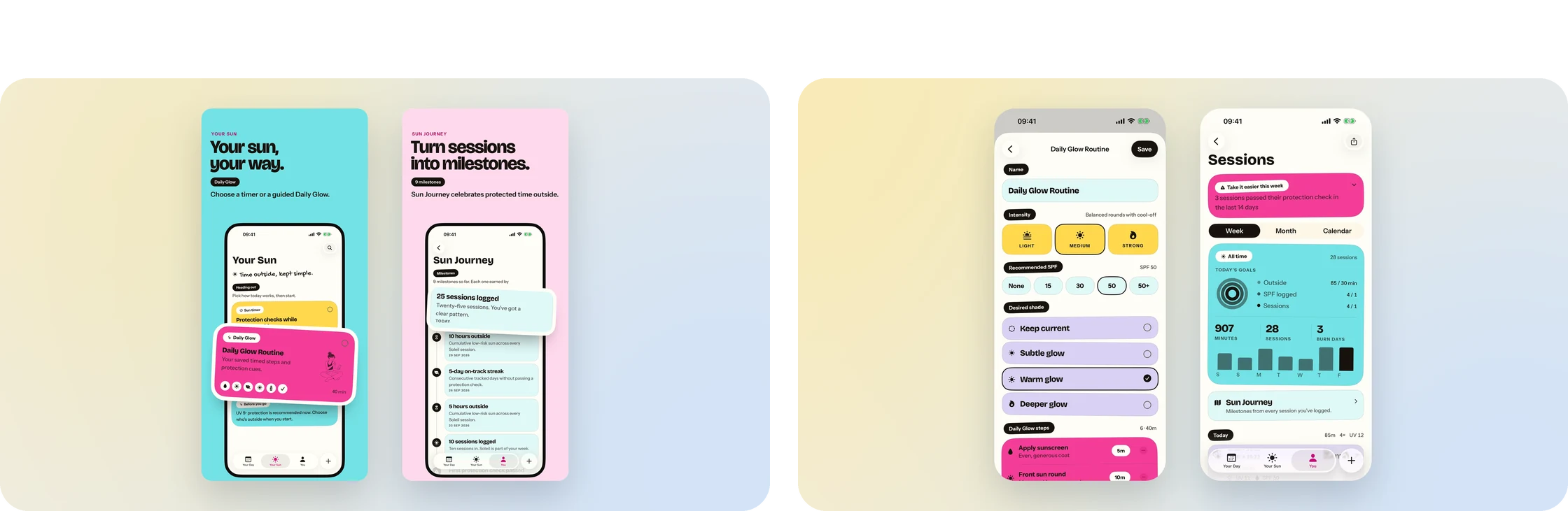
Left A Daily Glow routine and the Sun Journey milestones. Right Custom cards and charts: the routine editor and weekly sessions.
I curated a consistent set of AI-generated illustrations around the brand, giving the app recognisable people and moments. The finished interface uses custom cards, charts, controls and visual treatments across most surfaces, while keeping familiar navigation where it helps. Colour gives live conditions, actions, protection and history distinct roles, and the illustrations add warmth to a subject that can otherwise feel clinical. The website and the app became parts of the same visual world, and the same language later became the foundation for my iOS app Job Search, which I refined alongside Soleil.

Left Website hero: Know the UV. Enjoy the day. Right Website on mobile: hero and the UV answer.
Personalisation and scope
The competitor I studied estimated skin type from an AI photo scan without grounding it in the Fitzpatrick scale, the standard dermatologists use. Soleil’s onboarding lets people establish a Fitzpatrick skin profile through questions, a manual choice or an optional photo-assisted estimate they can confirm or change. I treated that profile as an input to cautious protection guidance, never a diagnosis or a guarantee of time in the sun.
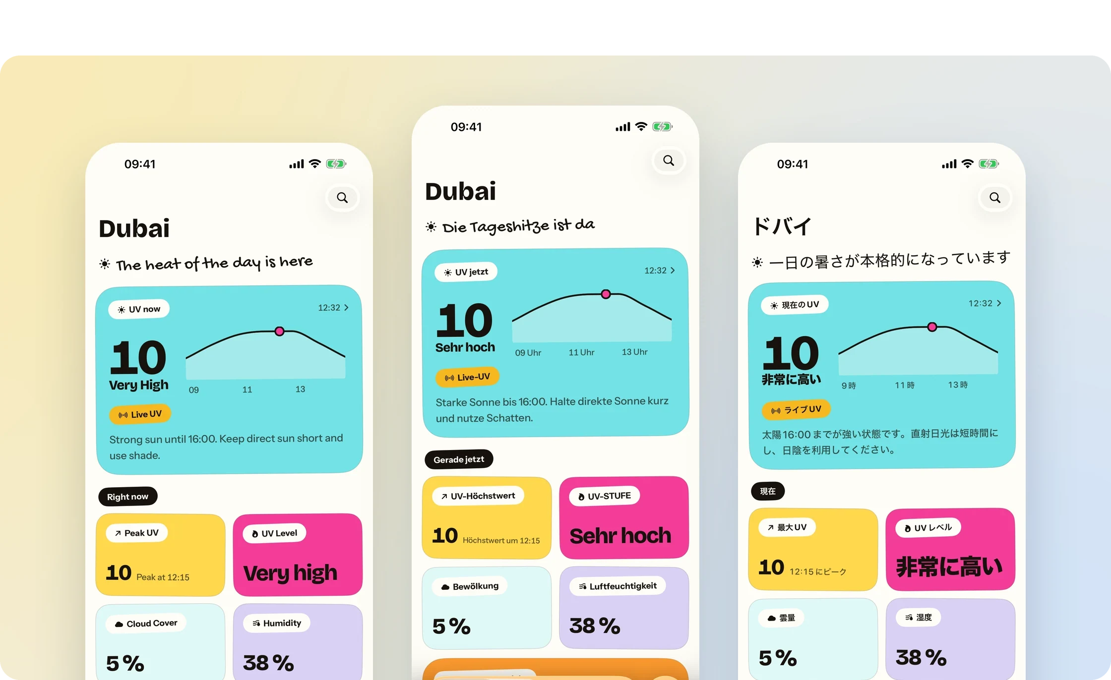
Localised: Your Day in English, German and Japanese.
The Apple Watch companion shows UV and session time and can start an outing. With permission, Soleil reads Apple’s Watch-derived Time in Daylight and places those periods against the day’s UV curve, giving history more context without presenting daylight as an allowance. The product extends to widgets, Live Activities and the Dynamic Island, and its app and App Store material are localised into English, German, Spanish, French and Japanese. Just as deliberately, it doesn’t turn sunlight into a vitamin D number. The competitor tallied the vitamin D someone had made by sitting in the sun, a figure a phone can’t reliably measure and one that makes sun exposure sound like a goal, so I left it out.

Left Family profiles: skin types for each person, and the household’s outing record. Right Localised: Your Sun in French, Spanish, Japanese.
Build
Native Apple frameworks, from the wrist to the Lock Screen
Soleil is built in SwiftUI across iPhone and Apple Watch, with SwiftData for local records, WeatherKit for UV and conditions, and Swift Charts for the shape of the day. ActivityKit and WidgetKit carry a live outing to the Lock Screen, Dynamic Island and widgets; WatchConnectivity keeps the Watch in step, and HealthKit provides Apple's Time in Daylight with permission. Apple Foundation Models write optional on-device guidance copy. The optional skin-tone estimate goes through a private proxy to a vision model, with an on-device fallback and user confirmation, and StoreKit handles the Pro subscription.
SwiftUI
watchOS
WeatherKit
HealthKit
WatchConnectivity
Widgets
Live Activities
Foundation Models
OpenAI Vision
Cloudflare Workers
01
No safe-time promise
The outing clock records elapsed time; it never counts down to a moment that looks safe.
02
Protection that carries through
A protection check recorded in the app is reflected in the Lock Screen activity during the outing.
03
Estimates stay estimates
Skin profile and guidance inform caution and are confirmed by the user; they're never a diagnosis.
Outcome
A complete product, ready for the App Store
Soleil is complete, tested with my family through TestFlight, including on holiday, and launching on the App Store in October 2026. On iPhone, it brings together live UV, protection checks and family outings; Apple Watch, Live Activities and widgets bring the relevant parts of the day to glanceable surfaces. The app and its App Store presentation are localised into English, German, Spanish, French and Japanese. Its central decision holds throughout: a clear UV reading and practical protection prompts, never a countdown that looks like permission.
UV-first guidance
Current UV and its category lead, supported by the hourly curve, a protection check and data freshness.
Family outings
Profiles, per-person sunscreen records and reminders for everyone who's out.
Beyond the phone
UV and outing time on Apple Watch; protection status in Live Activities; current conditions and family status in widgets.
Brand and product as one
One expressive visual language across the app and the website.
Status
In development · TestFlight · Planned App Store launch October 2026
In development · TestFlight · Planned App Store launch October 2026
View website →
Reflection
What a number implies matters as much as what it says
The countdown looked like the most useful feature and was the most misleading. A precise figure carries an implied promise, and in a health-adjacent product that promise has to be earned or removed. I would always rather design an interface that helps someone act sensibly and is open about its uncertainty than one that looks authoritative and quietly overclaims.


