Telefónica Alpha
·
Aug 2018 - Nov 2018
Telefónica Alpha
Extending an emerging visual language across mobile app screens and REMIX brand explorations for Telefónica Alpha.

Role
Visual Designer
Timeline
Aug 2018 - Nov 2018
Team
Small Telefónica Alpha product team
Platform
iOS / Android
Overview
An expressive visual language for REMIX
Telefónica Alpha was Telefónica's innovation organisation, exploring new products where technology meets wellbeing. I joined a small team working on REMIX, a mobile wellbeing app concept that let people describe their interests and how they felt, then discover activities that might appeal to them. I was engaged as the visual designer. The team had an emerging design language, and my role was to apply and develop it across new screens and use cases, with UX input as those screens took shape, and to explore how the REMIX identity could extend beyond the app.
One visual language
A coloured text-block style carried from onboarding to moods and activities
English and Spanish
Typography and layouts built to hold translated copy
Identity explorations
Wordmark, icons, category colours and a dynamic logo
Challenge
Making one expressive idea hold together
REMIX's personality came from a bold graphic idea: coloured blocks of text that build up a personal description. It was striking on a single screen. The challenge was to make it hold together across very different content, from onboarding and mood selection to activity suggestions, detail cards and saved activities, and across two languages whose phrases change length.
How do you extend a playful, text-led visual language across a whole app, and keep it coherent when the copy changes length and language?
Approach
One language, stretched across screens, languages and brand
Making the language work across the app
Onboarding used coloured text blocks to build up a personal description, from interests and personality to how someone was feeling. Later screens used the same colours and graphic style for choosing current and desired feelings, activity suggestions, detail cards, and saved or completed activities. I worked through each of those screens so they read as one product, feeding UX input into how they took shape.

Left Onboarding builds a personal description from coloured text blocks. Right Benefits and steps: the language carrying longer instructional content.

Activity cards in the same language, with colour distinguishing each category.
Activity detail, in motion (video).
Designing for copy that changes length
Typography, spacing, line breaks and composition carried most of the weight. The interface had to accommodate very different amounts of copy, and the English and Spanish versions made that especially important: translated phrases changed length and couldn’t simply be dropped into a fixed layout.
I designed the text-block compositions to flex, so the language kept its character whether a phrase was short and punchy or long and translated. A style built on words only works if it can carry any words.
Text blocks building as the copy changes (video).
Extending the identity
The project also asked for an exploration of how REMIX’s visual language could extend beyond the app, into posters, social and promotional material. I explored how the name and language could appear in logos, app icons and category colours, including a dynamic logo that mapped colour to themes such as productivity, social, experiences, self-knowledge and health. Poster, tote and cassette mockups tested the identity in use, so the app and the way the concept was presented felt like one idea.
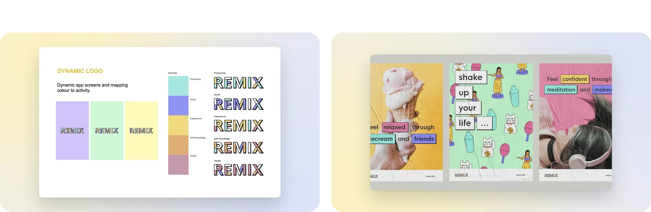
Left The dynamic logo mapping colour to activity. Right A concept for the identity in use.
Outcome
A language that held from screen to brand
The work carried REMIX's emerging visual language across onboarding, mood and activity screens, in English and Spanish, and out into a set of identity explorations, from wordmark and icons to category colours and promotional applications. It gave the concept a coherent, recognisable voice from the first onboarding screen to the way it was presented.
Coherent app screens
Onboarding, moods, activities and saved states in one visual language.
Built for translation
Text-block layouts that flex for English and Spanish copy.
Identity explorations
Wordmark, icon, category colour and dynamic logo directions.
Beyond the screen
Poster, tote and cassette mockups for presenting the concept.
Reflection
Real content is the test of a visual language
A visual language can look finished on one hero screen and fall apart on the tenth, or in a second language. I judge a system by its edge cases: the longest phrase, the translated label, the screen nobody designed first. That's where REMIX's style had to prove itself, and why I keep edge cases in view throughout the design process, not only at the end.


